Art Overhaul.
Hey everyone, Mad Monkey Games here! For this post I wanted to talk more about the art.
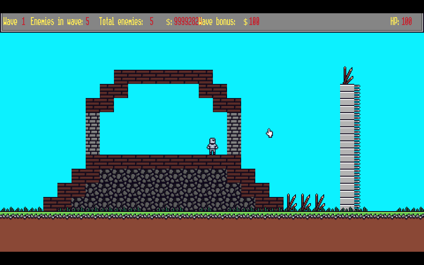
Once again, I was not happy with the way the art looked, so I once again went through the process to create a style I liked. The first thing I did was nail down whether I wanted to do pixel art or HD art.
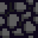
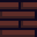
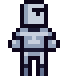
I decided on pixel art because it felt it fit the feel of the game better. After that I decided on whether I should use an outline. I decided to use an outline but instead of making it black I made it a dark blue. This helped with the slightly more cartoony feel I was going for. The main thing I changed is that for each individual thing that needs to be shaded I only used one color and did either only shadows or only highlights. This also helped give it a more cartoony feel.


Thanks for reading! Feel free to post any comments or ideas.
Get Blocks Keep
Blocks Keep
Build up a massive fort to defend yourself from the oncoming hordes of enemies!
More posts
- Inventory!Jan 05, 2020
- Menu transition, music and sounds effects.Jan 02, 2020
- Menu!Dec 30, 2019
- Money SystemDec 26, 2019
- Mouse over UI.Dec 22, 2019
- First downloadable demo!Dec 11, 2019
- UI, Spikes, and Wave polish.Dec 10, 2019
- Spike Traps!Dec 10, 2019
- Enemy Waves!Dec 09, 2019

Comments
Log in with itch.io to leave a comment.
This looks great man!
Thank you! Greatly appreciated.